This help doc contains copy-paste CSS code for a lot of commonly requested customizations to our app. We hope this helps you choose the customizations you like and make the Wishlist Plus truly unique for your customers :)
You can simply copy and paste the code in the CSS file of your store. If you're a beginner, here's a help doc that'll guide you through adding Custom CSS to your Shopify Store.
NOTE: Some solutions might require to be modified slightly for your store. If there are any slight corrections required, you can edit the values (color, font, etc.) as necessary, or feel free to reach us via chat/email at support@swymcorp.com and we'd be happy to help you with that :)
Key terms used:
- ATC - Add to Cart
- PDP - Product Description Page (Product page)
- PLP - Product Listing Page (Collections)
- SFL - Save for Later (a feature in Wishlist Plus)
- WL - Wishlist
- UI - User Interface
TABLE OF CONTENTS
- Wishlist Launchpoint and Header Icon
- Collections Page and Collections Sections
- Product Page Button
- Wishlist Page/Popup
- Rounded corners on all Wishlist Plus Elements
- Make the ATC button big on the WL page
- Remove ATC button from WL Page
- Product title gets cut off?
- Product Images are getting cut off?
- Quick-code to change the entire app's color theme
- Center the ‘My Wishlist’ text on the top
- Minimalist Wishlist Page (Full page-width)
- WL Product cards layout - Horizontal - Grid
- WL Product cards layout - Horizontal - List
- WL Product cards as list (similar to cart page)
- Change ‘Remove’ button (X) to a trash icon
- Wishlist List view with Trash icon
- Disabled Share Wishlist - CSS tooltip on hover
- Hide drafted products from the WL Page
- Show ‘Unavailable’ text on drafted products
- Hide Discount price and show only the Actual price
- Other
Wishlist Launchpoint and Header Icon
Default Header Counter
Note: This does not apply if you implemented the Counter through code. Although, if you're familiar with code, you may edit the selectors accordingly and use the below CSS.
Light background

span.swym-header-launcher-badge.cart-count-bubble {
    position: absolute;
    top: -0.3rem;
    left: unset !important;
    right: -0.4rem;
    font-size: 0.6rem;
    background: white;
    border: 1px solid black;
    padding: 0px 5px;
    border-radius: 1rem;
}
Dark background

span.swym-header-launcher-badge.cart-count-bubble {
    position: absolute;
    top: -0.3rem;
    left: unset !important;
    right: -0.4rem;
    font-size: 0.6rem;
    background: black;
    color: white;
    padding: 0px 5px;
    border-radius: 1rem;
}
Just a dot indicator

span.swym-header-launcher-badge.cart-count-bubble {
    position: absolute;
    top: 0;
    left: unset !important;
    right: -0.1rem;
    font-size: 0rem;
    background: white;
    border: 4px solid black;
    border-radius: 1rem;
    outline: 2px solid white;
    padding: 0;
}
Fill the header icon when there are products in the Wishlist
NOTE: You need to implement the Header Counter solution via code for this to work. Here's a help doc that will you guide you through the same.
Before:

After:

body:has(span.swym-wishlist-header-counter.show-badge) i.icon-swym-wishlist:after {
    content:'\f004';
    color: #b99f50;
    -webkit-text-stroke: #471f46 2.5px;
}
Floating Launchpoint
For the next 2 customizations, we're looking at the following launchpoint configuration:
 You can set this by going to
→ Shopify Admin
→ Apps
→ Wishlist Plus
→ Features
→ Manage Configuration
→ Launch Point
and then select 'Floating button' and the position as 'Right'
And this is how it looks by default:

Floating launchpoint on the edges - Vertical Design 1

@media screen and (min-width: 571px) {
#swym-anchor a#notepad-anchor-title {
    writing-mode: vertical-lr;
    text-orientation: upright;
    text-wrap: wrap;
    display: flex !important;
    align-items: start;
    flex-wrap: wrap !important;
    height: unset !important;
    padding: 0.5rem 0.6rem;
    border-radius: 5px;
}

i.swym-icon.swym-notepad-white {
    display: flex;
}

i.swym-icon.swym-notepad-white, i.swym-icon.swym-notepad-white:after {
    position: unset !important;
}

i.swym-icon.swym-notepad-white {
    width: unset !important;
    height: unset !important;
    translate: 0 -0.5rem;
}

i.swym-icon.swym-notepad-white:after {
    -webkit-text-stroke: 2px #FF4500 !important;
}
}
Floating Icon on the edges - Vertical Design 2

#swym-anchor a#notepad-anchor-title {
    writing-mode: vertical-lr;
    transform: rotate(180deg);
    text-wrap: wrap;
    display: flex !important;
    align-items: start;
    flex-wrap: wrap !important;
    height: unset !important;
    padding: .5rem 1rem .5rem .6rem !important;
    border-bottom-right-radius: 10px;
    border-top-right-radius: 10px;
    letter-spacing: 3px;
    padding-right: 1rem;
}

i.swym-icon.swym-notepad-white {
    display: flex;
}

i.swym-icon.swym-notepad-white, i.swym-icon.swym-notepad-white:after {
    position: unset !important;
}

i.swym-icon.swym-notepad-white {
    width: unset !important;
    height: unset !important;
    translate: 0 -0.5rem;
    transform: rotate(180deg) !important;
}

i.swym-icon.swym-notepad-white:after {
    -webkit-text-stroke: 2px #68bbeb !important;
}

@media screen and (max-width: 570px) {
    #swym-anchor a#notepad-anchor-title {
        text-indent: unset;
        width: unset;
    }
    #swym-plugin #swym-anchor i, #swym-hosted-plugin #swym-anchor i {
        margin-left: unset;
    }
}

span.swym-anchor-badge.show-badge {
    background: #009de2 !important;
    border: 1px solid #009de2 !important;
}
Collections Page and Collections Sections
Collections page Variant Selector UI
When you have 0 Wishlists, the UI looks like this:

But when you have more than 1 Wishlist:

And even if you have more than 1 Wishlist, only one will be displayed there. You can use the below code if you want it to display like this: 
.swym-variant-selector-wishlist-item, button#swym-vs-add-to-wishlist, span#swym-custom-wishlist-actions-title {
    display: none;
}

.swym-vs-wishlist-actions-container {
    width: 100%;
}

span.swym-custom-create-wishlist-button {
    height: unset !important;
    background: unset !important;
}

div#swym-custom-wishlist-actions {
    width: auto;
    flex-direction: unset;
    max-width: unset;
    display: flex;
    justify-content: center;
    align-items: center;
    gap: 0.5rem;
}

span.swym-custom-create-wishlist-text {
    margin-top: unset !important;
}
Product Page Button
Also referred to as the "PDP button"
Make the PDP button take up full-width like the ATC button
Heart icon to the extreme left

button.swym-button.swym-add-to-wishlist {
    flex-grow: 1;
    text-indent: unset !important;
}

.swym-btn-container.swym-inject {
    display: flex;
}

.swym-button-bar.swym-wishlist-button-bar, .swym-btn-container {
    width: 100% !important;
}

.swym-button-bar.swym-wishlist-button-bar.swym-inject {
    margin-left: unset;
    margin-right: unset;
}
Heart icon centered

button.swym-button.swym-add-to-wishlist {
    flex-grow: 1;
    text-indent: unset !important;
    display: flex !important;
    flex-direction: row-reverse;
    justify-content: center;
    align-items: center;
}

button.swym-button.swym-add-to-wishlist:after{
    position: unset;
}

.swym-btn-container.swym-inject {
    display: flex;
}

.swym-button-bar.swym-wishlist-button-bar, .swym-btn-container {
    width: 100% !important;
}

.swym-button-bar.swym-wishlist-button-bar.swym-inject {
    margin-left: unset;
    margin-right: unset;
}
PDP Button hover animation
Changes the default look to:

When you hover over the button on desktop, adds an animation and fills the button from the bottom-left:

Here's a link to a short video demonstrating the animation.
button.swym-button.swym-add-to-wishlist.swym-inject:before {
    content: '';
    font-size: 30px;
    color: white !important;
    font-family: "swym-font";
    position: absolute;
    top: 0;
    left: -10%;
    width: 120%;
    height: 100%;
    transform-origin: bottom left;
    transform: rotate3d(0, 0, 1, 26deg) translate3d(-1.2em, 110%, 0);
    background: black !important;
    transition: all .25s cubic-bezier(.104,.204,.492,1);
    z-index: -1;
}

button.swym-button.swym-add-to-wishlist.swym-inject:hover:before {
    transform: rotate3d(0,1,1,0) translateZ(0);
}

button.swym-button.swym-add-to-wishlist.swym-inject {
    clip-path: inset(0 0 0 0);
    /* border: 1px solid; */ /* OPTIONAL - commented for ease of access */
    background: white !important;
    color: black !important;
}

button.swym-button.swym-add-to-wishlist.swym-inject:hover:after {
    color: white !important;
}

button.swym-button.swym-add-to-wishlist.swym-inject:after {
    transition: all .25s cubic-bezier(.104,.204,.492,1);
    width: 48px;
    color: black !important;
}

span.swym-tooltip.swym-inject.swym-tooltip-clickable {
    display: none !important;
}

button.swym-button.swym-add-to-wishlist.swym-inject:hover {
    color: white !important;
}
PDP Button ToolTip reposition
Default Tooltip:

After adding the below CSS:

This is perfect if your Wishlist heart icon is sitting on the right side of the page, and there's some gap on the left.
.swym-btn-container[data-position=default] .swym-button .swym-tooltip .swym-tooltip-text {
    transform: translateY(-40px) !important;
    left: -120px !important;
    top: 50px;
}

.swym-btn-container[data-position=default] .swym-button.show-tooltip .swym-tooltip .swym-tooltip-text {
    transform: translate(-10px, -40px) !important;
}
'Back-in-Stock Alerts' app PDP button full-width

.swym-button-bar.swym-isa-button-bar.swym-inject, .swym-btn-container.swym-inject {
     width: 100%;
     height: 100%;
}
 button.swym-button.swym-add-to-watchlist.swym-inject {
     width: 100% !important;
     border-radius: 5px !important;
     height: 100%;
}
 span.swym-watchlist-cta {
     font: 13px 'Crimson Text', Serif;
     letter-spacing: 3px;
}
Wishlist Page/Popup
Rounded corners on all Wishlist Plus Elements

CSS to get rounded corners on all the elements and/or buttons (gives you Wishlist UI a clean and modern look)
Please adjust the "16px" value as required to best fit your theme :)
button.swym-sfl-add-all-to-cart-btn, .swym-wishlist-outer-container, .swym-modal-content, .swym-wishlist-item, button.swym-wishlist-list-card.swym-is-button.user-list, button.swym-share-btn.swym-color-2, button.swym-add-all-to-cart-btn, .swym-sfl-card-product-item, .swym-wishlist-context-menu-content, button.swym-button {
    border-radius: 16px;
}
button.swym-close-btn.swym-bg-1.swym-bg-4.swym-color-4.swym-is-button {
    border-top-right-radius: 16px;
}
.swym-wishlist-image-wrapper {
    border-top-left-radius: 16px;
    border-top-right-radius: 16px;
}
button.swym-sfl-add-to-cart-btn {
    border-bottom-right-radius: 16px;
    border-bottom-left-radius: 16px;
}
button.swym-add-to-cart-btn {
    border-top-right-radius: 0;
    border-top-left-radius: 0;
}
Make the ATC button big on the WL page

Adjust the “12px” value as you see fit :)
.swym-ui-component .swym-wishlist-grid .swym-wishlist-item .swym-add-to-cart-btn {
    padding: 12px;
}
Remove ATC button from WL Page

This code simply hides the ATC button visually. If any of your customers know how to code, there's a chance they can access this button and add products to their cart.
We have a more robust solution that we can implement from our end that completely removes the button. Please reach out to us via chats or at support@swymcorp.com for that.
Kindly implement this solution only if it's super urgent to hide the ATC button.
button.swym-add-to-cart-btn {
    display: none !important;
}
Product title gets cut off?
In our default implementation, if you have long product titles, they get cut off and are visible only when you hover on the product. If you'd like to show the titles at all times, you can implement the below CSS.

h2.swym-title.swym-title-1 {
    overflow: unset !important;
    text-wrap: wrap !important;
}
Product Images are getting cut off?
In our default implementation, if you have long product images, they get cut off on the top and bottom. This is an intentional height limit (180px) to ensure all the Wishlist product cards are consistent and have good proportions.
- You can add this code to remove the height limit
.swym-wishlist-image-wrapper {
    height: unset !important;
}
The above code simply removes the height limit - meaning, all products will be of their full height.
If the products have varying image-sizes, then adding the above code will result in all product cards being in different heights.
If your store has product images with varying image-sizes, to avoid a bad user experience, it is recommended to add a reasonable height limit by adjusting the following code:
.swym-wishlist-image-wrapper {
    height: 250px !important;
}
Quick-code to change the entire app's color theme
Replace the below color with the hex code of the color of your choice
.swym-bg-2 {
    background: #03000C !important;
}
Center the ‘My Wishlist’ text on the top

.swym-wishlist-main-title.swym-heading.swym-heading-1 {
    font-size: 2.6rem !important;
    font-weight: 100 !important;
    position: absolute;
    left: 50%;
    translate: -50%;
    margin: 0 !important;
}

.swym-wishlist-container-title-bar.swym-bg-1.swym-bg-2.swym-color-4 {
    justify-content: end;
}
Minimalist Wishlist Page (Full page-width)
If you want to keep the default font of your store, remove the first 3 lines.
[class*="swym"]:not(body) {
     font-family: monospace, 'swym-font', sans-serif !important;
}
 .swym-wishlist-main-title.swym-heading.swym-heading-1 {
     font-weight: 100 !important;
     margin: 0 !important;
}
 .swym-wishlist-container-title-bar.swym-bg-1.swym-bg-2.swym-color-4 {
     justify-content: center;
     border-bottom: 0;
}
 .swym-wishlist-item {
     border: 0 !important;
}
 .swym-wishlist-detail-header, button#swym-user-login-status-btn {
     display: none !important;
}
 .swym-wishlist-detail-separator {
     max-width: 80%;
     margin: 0 auto !important;
}
 .swym-ui-component.swym-wishlist-page.swym-simple-wishlist-page {
     max-width: unset !important;
}
 ul.swym-wishlist-grid {
     max-width: unset !important;
     width: 95% !important;
}
 .swym-wishlist-image-wrapper {
     height: unset !important;
}
 .swym-wishlist-container-title-bar.swym-bg-1.swym-bg-2.swym-color-4 {
     margin: 5rem;
     padding-right: unset !important;
     background: transparent;
     color: black;
}
 .swym-product-price.swym-text.swym-text-1, h2.swym-title.swym-title-1 {
     font-weight: unset !important;
}
 button.swym-add-to-cart-btn {
     font-size: 1rem !important;
     padding: 1rem !important;
}
 .swym-wishlist-main-title.swym-heading.swym-heading-1 {
     font-size: 0 !important;
}
 .swym-wishlist-main-title.swym-heading.swym-heading-1:after {
     content: 'Wishlist';
     font-size: 2rem !important;
}
 .swym-wishlist-main-title.swym-heading.swym-heading-1:before {
     content: 'My ';
     font-size: 2rem !important;
     margin-right: 1rem;
}
 .swym-wishlist-detail-content {
     margin-top: 4rem !important;
}
 .swym-wishlist-main-title.swym-heading.swym-heading-1 {
     display: flex !important;
     justify-content: center;
}
.swym-empty-wishlist-container {
     display: none !important;
}
 .swym-wishlist-detail-content {
     min-height: 300px;
}
WL Product cards layout - Horizontal - Grid

ul.swym-wishlist-grid li {
    width: 45% !important;
    margin: 0 auto !important;
    margin-bottom: 4% !important;
}

.swym-wishlist-item {
    display: grid !important;
    grid-template-columns: 1fr 1fr;
}

.swym-wishlist-image-wrapper {
    grid-column: 1 / 2;
    grid-row: 1 / 5;
    height: unset !important;
    width: 100%;
    display: flex;
}

.swym-wishlist-item > :not(.swym-wishlist-image-wrapper) {
    grid-column: 2 / 3;
}

img.swym-wishlist-image {
    object-fit: cover;
}

@media screen and (max-width: 900px) {
    ul.swym-wishlist-grid li {
        width: 100% !important;
    }
    .swym-ui-component .swym-wishlist-grid .swym-wishlist-image-wrapper {
        max-height: unset;
    }
}
WL Product cards layout - Horizontal - List
Desktop view:

Mobile view:

ul.swym-wishlist-grid {
    flex-direction: column;
}

ul.swym-wishlist-grid li {
    width: 70% !important;
    margin: 0 auto !important;
    margin-bottom: 4% !important;
}

.swym-wishlist-item {
    display: grid !important;
    grid-template-columns: 1fr 3fr;
}

.swym-wishlist-image-wrapper {
    grid-column: 1 / 2;
    grid-row: 1 / 5;
    height: unset !important;
    width: 100%;
    display: flex;
    justify-content: center;
}

.swym-wishlist-item > :not(.swym-wishlist-image-wrapper) {
    grid-column: 2 / 3;
}

img.swym-wishlist-image {
    object-fit: cover;
}

button.swym-add-to-cart-btn {
    height: clamp(30px, 60%, 100%) !important;
    align-self: end;
}

@media screen and (max-width: 900px) {
    .swym-wishlist-item {
        grid-template-columns: 2fr 3fr;
    }
    .swym-ui-component .swym-wishlist-grid .swym-wishlist-image-wrapper {
        max-height: unset !Important;
    }
}
WL Product cards as list (similar to cart page)
SUPPORTS MULTIPLE WISHLISTS!
Desktop view:

Mobile view:

ul.swym-wishlist-grid {
    flex-direction: column;
}

ul.swym-wishlist-grid li {
    width: 100% !important;
    margin: 0 auto !important;
    margin-bottom: 4% !important;
}

.swym-wishlist-item {
    display: grid !important;
    grid-template-columns: repeat(5, 1fr) 0.3fr 0.3fr;
    grid-template-rows: 1fr 1fr;
    grid-template-areas:
        "img title1 title1 price atc . del"
        "img title2 title2 price atc . del";
    border-radius: 1rem;
    border: 0 !important;
}

.swym-wishlist-item .swym-wishlist-image-wrapper {
    height: unset !important;
    width: 100%;
    display: flex;
    justify-content: center;
    grid-area: img;
}

button.swym-delete-btn.swym-nav.swym-nav-1.swym-is-button {
    grid-area: del;
    position: unset;
    align-self: center;
}

button.swym-is-button:has(h2.swym-title.swym-title-1) {
    grid-area: title1;
}

h2.swym-title.swym-title-1:hover {
    text-wrap: wrap !important;
}

.swym-variant-title.swym-text.swym-title-2 {
    grid-area: title2;
    display: flex;
}

.swym-product-price.swym-text.swym-text-1 {
    grid-area: price;
}

button.swym-add-to-cart-btn {
    grid-area: atc;
    align-self: center;
    border-radius: 1rem;
    min-width: 5rem !important;
}

.swym-wishlist-item img.swym-wishlist-image {
    max-height: 150px;
    border-top-left-radius: 1rem;
    border-bottom-left-radius: 1rem;
    aspect-ratio: 1 / 1 !important;
    object-fit: cover;
}

@media screen and (max-width: 550px) {
    .swym-wishlist-item {
        grid-template-columns: 2fr 2fr 1fr;
        grid-template-rows: 1fr 1fr 1fr;
        grid-template-areas:
            "img title1 price"
            "img title2 price"
            "img atc atc";
    }
    button.swym-delete-btn.swym-nav.swym-nav-1.swym-is-button {
        grid-area: del;
        position: absolute;
        z-index: 10;
    }
    button.swym-add-to-cart-btn {
        margin: 0 2rem !important;
    }
    .swym-wishlist-image-wrapper {
        min-width: 30vw;
    }
    .swym-product-price.swym-text.swym-text-1 {
        flex-direction: column;
        align-self: end !important;
    }
}

@media screen and (max-width: 901px) {
    .swym-wishlist-detail-content {
        margin-top: 2rem !important;
    }
    .swym-product-price.swym-text.swym-text-1 {
        flex-direction: column;
        align-self: center;
    }
}

.swym-wishlist-images .swym-wishlist-image-wrapper {
    height: 160px !important;
    display: flex;
    justify-content: center;
}
Change ‘Remove’ button (X) to a trash icon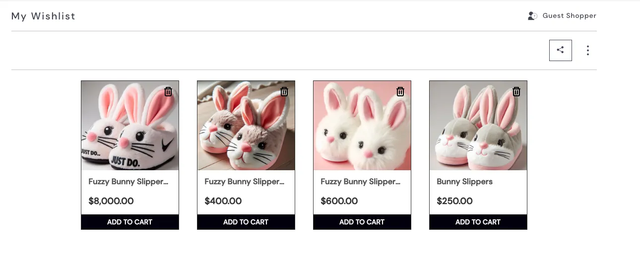
.swym-ui-component .swym-wishlist-grid .swym-wishlist-item .swym-delete-btn .swym-icon {
  position: absolute;
  width: 10px;
  height: 12px;
  border: 2px solid transparent;
  box-shadow:
    0 0 0 2px,
    inset -2px 0 0,
    inset 2px 0 0;
  border-bottom-left-radius: 1px;
  border-bottom-right-radius: 1px;
  margin-top: 4px;
}
.swym-ui-component .swym-wishlist-grid .swym-wishlist-item .swym-delete-btn .swym-icon::after,
.swym-ui-component .swym-wishlist-grid .swym-wishlist-item .swym-delete-btn .swym-icon::before {
  content: "";
  position: absolute;
}
.swym-ui-component .swym-wishlist-grid .swym-wishlist-item .swym-delete-btn .swym-icon::after {
  background: currentColor;
  border-radius: 3px;
  width: 16px;
  height: 2px;
  top: -4px;
  left: -5px;
}
.swym-ui-component .swym-wishlist-grid .swym-wishlist-item .swym-delete-btn .swym-icon::before {
  width: 10px;
  height: 4px;
  border: 2px solid;
  border-bottom: transparent;
  border-top-left-radius: 2px;
  border-top-right-radius: 2px;
  top: -7px;
  left: -2px;
  color: black;
}
Wishlist List view with Trash icon
Desktop view:

Mobile view:

.swym-ui-component .swym-wishlist-grid .swym-wishlist-item .swym-delete-btn .swym-icon {
  position: absolute;
  width: 10px;
  height: 12px;
  border: 2px solid transparent;
  box-shadow:
    0 0 0 2px,
    inset -2px 0 0,
    inset 2px 0 0;
  border-bottom-left-radius: 1px;
  border-bottom-right-radius: 1px;
  margin-top: 4px;
}
.swym-ui-component .swym-wishlist-grid .swym-wishlist-item .swym-delete-btn .swym-icon::after,
.swym-ui-component .swym-wishlist-grid .swym-wishlist-item .swym-delete-btn .swym-icon::before {
  content: "";
  position: absolute;
}
.swym-ui-component .swym-wishlist-grid .swym-wishlist-item .swym-delete-btn .swym-icon::after {
  background: currentColor;
  border-radius: 3px;
  width: 16px;
  height: 2px;
  top: -4px;
  left: -5px;
}
.swym-ui-component .swym-wishlist-grid .swym-wishlist-item .swym-delete-btn .swym-icon::before {
  width: 10px;
  height: 4px;
  border: 2px solid;
  border-bottom: transparent;
  border-top-left-radius: 2px;
  border-top-right-radius: 2px;
  top: -7px;
  left: -2px;
  color: black;
}

ul.swym-wishlist-grid {
    flex-direction: column;
}

ul.swym-wishlist-grid li {
    width: 100% !important;
    margin: 0 auto !important;
    margin-bottom: 4% !important;
}

.swym-wishlist-item {
    display: grid !important;
    grid-template-columns: repeat(4, 1fr) 0.3fr 0.3fr 1fr;
    grid-template-rows: 1fr 1fr;
    grid-template-areas:
        "img title1 title1 price del . atc"
        "img title2 title2 price del . atc";
    border-radius: 1rem;
    border: 0 !important;
}

.swym-wishlist-item .swym-wishlist-image-wrapper {
    height: unset !important;
    width: 100%;
    display: flex;
    justify-content: center;
    grid-area: img;
}

button.swym-delete-btn.swym-nav.swym-nav-1.swym-is-button {
    grid-area: del;
    position: unset;
    align-self: center;
}

button.swym-is-button:has(h2.swym-title.swym-title-1) {
    grid-area: title1;
}

h2.swym-title.swym-title-1:hover {
    text-wrap: wrap !important;
}

.swym-variant-title.swym-text.swym-title-2 {
    grid-area: title2;
    display: flex;
}

.swym-product-price.swym-text.swym-text-1 {
    grid-area: price;
    padding-bottom: 0 !important;
}

button.swym-add-to-cart-btn {
    grid-area: atc;
    align-self: center;
    border-radius: 1rem;
    min-width: 5rem !important;
}

.swym-wishlist-item img.swym-wishlist-image {
    max-height: 150px;
    border-top-left-radius: 1rem;
    border-bottom-left-radius: 1rem;
    aspect-ratio: 1 / 1 !important;
    object-fit: cover;
}

@media screen and (max-width: 550px) {
    .swym-wishlist-item {
        grid-template-columns: 2fr 2fr 1fr;
        grid-template-rows: 1fr 1fr 1fr;
        grid-template-areas:
            "img title1 price"
            "img title2 price"
            "img atc atc";
    }
    button.swym-delete-btn.swym-nav.swym-nav-1.swym-is-button {
        grid-area: del;
        position: absolute;
        z-index: 10;
    }
    button.swym-add-to-cart-btn {
        margin: 0 2rem !important;
    }
    .swym-wishlist-image-wrapper {
        min-width: 30vw;
    }
    .swym-product-price.swym-text.swym-text-1 {
        flex-direction: column;
        align-self: end !important;
    }
}

@media screen and (max-width: 901px) {
    .swym-wishlist-detail-content {
        margin-top: 2rem !important;
    }
    .swym-product-price.swym-text.swym-text-1 {
        flex-direction: column;
        align-self: center;
    }
}

.swym-wishlist-images .swym-wishlist-image-wrapper {
    height: 160px !important;
    display: flex;
    justify-content: center;
}
Disabled Share Wishlist - CSS tooltip on hover
Displays a tooltip over the share button when the 'Share Wishlist' feature is disabled (i.e. the user is not signed in)

button.swym-share-btn.swym-color-2.swym-disabled {
    position: relative;
    transition: 0.3s;
    opacity: 1;
    border-color: rgb(0 0 0 / 0.4);
}

button.swym-share-btn.swym-color-2.swym-disabled {
    color: rgb(0 0 0 / 0.4);
}

button.swym-share-btn.swym-color-2.swym-disabled::before {
    content: 'Please login to share your Wishlist';
    width: 250%;
    position: absolute;
    left: -3.5rem;
    translate: -50% -35%;
    background: rgb(255 255 255 / 0.5);
    padding: 0.5rem;
    border-radius: 0.5rem;
    backdrop-filter: blur(5px);
    opacity: 0;
    transition: 0.3s;
    z-index: 2;
    color: black;
}

button.swym-share-btn.swym-color-2.swym-disabled:hover::before {
    opacity: 1;
}
Hide drafted products from the WL Page
In Shopify, you can put products as Active or Draft:

If a product is put on Draft, then the product card in the WL page looks like this by default:

Use this CSS to hide the products automatically:
ul.swym-wishlist-grid li:has(button.swym-add-to-cart-btn[aria-label="Unavailable"]){
    display: none;
}
The good news is… if the product is put back to Active, it will be displayed in the Wishlist again as usual.
Show ‘Unavailable’ text on drafted products
Following on the previous point’s context:

.swym-wishlist-item.swym-default-cursor:has(button.swym-add-to-cart-btn[aria-label="Unavailable"]) > * {
    opacity: 0.6;
}

.swym-wishlist-item.swym-default-cursor:has(button.swym-add-to-cart-btn[aria-label="Unavailable"]):after {
    content: 'Unavailable';
    position: absolute;
    font-size: 3.5rem;
    transform: rotate(315deg);
    color: white;
    opacity: 1;
    top: 50%;
    left: 50%;
    translate: -50% -50%;
    font-family: monospace;
    text-transform: uppercase;
}
Hide Discount price and show only the Actual price
Default view when a product has a discount:

After you add the below CSS:

.swym-product-final-price.swym-value {
    display: none !important;
}

.swym-product-original-price.swym-value {
    text-decoration-line: unset !important;
}
Other
Display ‘Added to Wishlist’ Toast Notification on the right
(Default is left)
This does not change for mobile since it doesn’t look good that way

@media screen and (min-width: 900px) {
    .swym-notifications-container.swymTopLeft {
        left: unset !important;
        right: 0;
        transform: translate(300px);
    }
}
SFL Section on Cart page takes full-width
Sometimes, the SFL section sticks to the edges of the page by default:

The below CSS adds a little gap on either end, so it looks a bit neat:

.swym-sfl-view-render-container.swym-ui-component.swym-is-safari {
    width: clamp(0px, 91%,1500px);
    margin: 0 auto;
}

button.swym-share-sfl-btn, button.swym-sfl-add-all-to-cart-btn, button.swym-sfl-add-to-cart-btn {
    border-radius: 10px;
}
Change the default bluish-gray color of the entire app
The default color of the app (especially if you're an old customer of Wishlist Plus) is bluish-black, and it looks like so:

To change this color, here’s all the code that renders that (filtered from the 6162 lines of default CSS that we inject).

.swym-ui-component .swym-action-bar .swym-back-btn,.swym-ui-component .swym-clear-wishlist-modal .swym-clear-wishlist-modal-dialog .swym-text-heading,.swym-ui-component .swym-color-5,.swym-ui-component .swym-empty-recently-viewed-container .swym-empty-recently-viewed-title,.swym-ui-component .swym-empty-wishlist-container .swym-empty-wishlist-title,.swym-ui-component .swym-product-comments .swym-comments-heading,.swym-ui-component .swym-product-comments .swym-product-comment,.swym-ui-component .swym-product-price .swym-product-original-price,.swym-ui-component .swym-recently-viewed-detail-header .swym-recently-viewed-user-status .swym-user-login-status,.swym-ui-component .swym-share-wishlist-modal .swym-share-wishlist-modal-dialog .swym-share-wishlist-input-container .swym-share-wishlist-note,.swym-ui-component .swym-share-wishlist-modal .swym-share-wishlist-modal-dialog .swym-share-wishlist-subheading,.swym-ui-component .swym-share-wishlist-modal .swym-share-wishlist-modal-dialog .swym-text-heading,.swym-ui-component .swym-simple-wishlist-container .swym-sfl-tab-container .swym-sfl-list-view .swym-sfl-list-heading .swym-sfl-title,.swym-ui-component .swym-wishlist-context-menu .swym-wishlist-context-menu-item,.swym-ui-component .swym-wishlist-detail-header .swym-wishlist-main-title,.swym-ui-component .swym-wishlist-note-popup .swym-note-container .swym-note-input,.swym-ui-component .swym-wishlist-product-detail-content .swym-product-meta,.swym-ui-component .swym-wishlist-product-detail-content .swym-wishlist-note-popup .swym-wishlist-note-btn .swym-empty-note,.swym-ui-component .swym-wishlist-product-detail-content .swym-wishlist-note-popup .swym-wishlist-note-btn .swym-value,.swym-ui-component .swym-wishlist-product-detail-content .swym-wishlist-product-description,.swym-ui-component .swym-wishlist-product-detail-content .swym-wishlist-product-title,.swym-ui-component.swym-wishlist-page .swym-sfl-tab-container .swym-sfl-list-view .swym-sfl-list-heading .swym-sfl-title,.swym-ui-components .swym-color-5, .swym-ui-component .swym-wishlist-product-detail-content .swym-wishlist-variants-container .swym-select select{
    color:#000
}
.swym-ui-component .swym-bg-2,.swym-ui-component .swym-wishlist-product-detail-content .swym-error-details-btn,.swym-ui-components .swym-bg-2{
    background:#000
}
.swym-ui-component .swym-border-color-1,.swym-ui-components .swym-border-color-1{
    border-color:#000
}
.swym-ui-component .swym-product-quantity, .swym-ui-component .swym-wishlist-product-detail-content .swym-wishlist-variants-container .swym-select select{
    border:1px solid #000
}
@media only screen and (min-width:900px){
    .swym-ui-component.swym-wishlist-page .swym-simple-wishlist-¸ .swym-action-bar .swym-back-btn,.swym-ui-component.swym-wishlist-page .swym-wishlist-container-title-bar .swym-user-login-status,.swym-ui-component.swym-wishlist-page .swym-wishlist-container-title-bar .swym-wishlist-main-title,.swym-ui-component.swym-wishlist-page .swym-wishlist-detail .swym-action-bar .swym-back-btn{
        color:#000
    }
}
@media only screen and (max-width:900px){
    .swym-ui-component .swym-share-wishlist-modal .swym-share-wishlist-modal-dialog .swym-text-heading,.swym-ui-component .swym-simple-wishlist-container .swym-wishlist-detail .swym-wishlist-main-title,.swym-ui-component .swym-user-login-status,.swym-ui-component .swym-wishlist-container-title-bar,.swym-ui-component .swym-wishlist-container-title-bar .swym-wishlist-main-title,.swym-ui-component .swym-wishlist-context-menu .swym-wishlist-context-menu-item,.swym-ui-component.swym-wishlist-page .swym-wishlist-container-title-bar .swym-wishlist-main-title,.swym-ui-component.swym-wishlist-page .swym-wishlist-detail .swym-action-bar .swym-back-btn{
        color:#000
    }
}
Quick-code to change the app’s font
You can use the following CSS and change the font-family according to your theme.
Replace ONLY “monospace”. If some elements are causing problems or are not changing, adjust them individually.
[class*="swym"]:not(body) {
    font-family: monospace, 'swym-font', sans-serif !important;
}
Was this article helpful?
That’s Great!
Thank you for your feedback
Sorry! We couldn't be helpful
Thank you for your feedback
Feedback sent
We appreciate your effort and will try to fix the article